By Charissa Echavez, | January 18, 2017

Mozilla
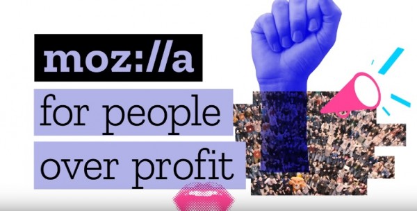
After nearly two decades, Mozilla has finally decided to do a major overhaul on its "brand identity," featuring a new logo, font, color, language architecture, and imagery.
Like Us on Facebook
The initiative started last June as an open source design process where the public was asked to submit and vote on various designs, an initiative to demonstrate Mozilla's "open and accessible" internet advocacy, the Venture Beat reported. The chosen design was made by Johnson Banks.
According to Johnson, the new logo aims to portray that Mozilla is a "core part of the internet" and was "at the beginning of advocacy for an open-source web."
Mozilla, on the other hand, said, "We want to be known as the champions for a healthy Internet... And as a not-for-profit organization, we're uniquely able to build products, technologies, and programs that keep the Internet growing and healthy, with individuals informed and in control of their online lives."
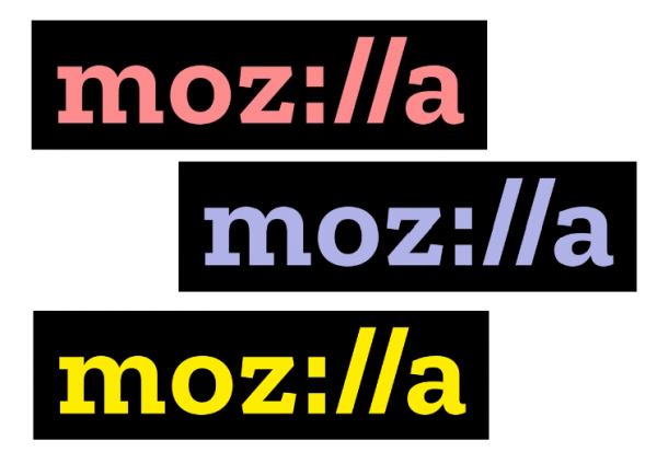
While many noted the major alteration of the logo, the biggest standout is the inclusion of "://" url signifier instead of the old "ill" (moz://a). It is an indication to signify that the "URL language reinforces that the Internet is at the heart of Mozilla," the company said.
It also introduced a new font for its wordmark called Zilla, which is an inspiration from the common Courier typeface used as a default for code. A black box is surrounding the logo to signify a key building block of the design. It was created by Netherlands-based type foundry Typotheque. Zilla is offered for free to everyone to keep up with Mozilla's open-source initiative.
The logo is black and white by default, but Mozilla offers multi-colored selections. Its color palette is also derived from highlight colors used by Firefox and other internet browsers. The variations aim to create a sense of personal experience from different users to allow them to establish their own identity.

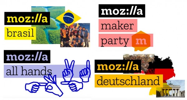
It also added language and language architecture with copy lines found right or below the logo to hold Mozilla messages such as program, event, and team names.
Through the initiative, people from around the world could customize their own identity by its color and imagery preference that is unique to them. The bounding boxes and typography, on the other hand, will indicate that they are a part of the big Mozilla community.

Meanwhile, Mozilla's new identity has started rolling out on Wednesday (Jan. 18) and will continue over the coming months for initiatives, campaigns, and conferences worldwide.
-
Use of Coronavirus Pandemic Drones Raises Privacy Concerns: Drones Spread Fear, Local Officials Say

-
Coronavirus Hampers The Delivery Of Lockheed Martin F-35 Stealth Fighters For 2020

-
Instagram Speeds Up Plans to Add Account Memorialization Feature Due to COVID-19 Deaths

-
NASA: Perseverance Plans to Bring 'Mars Rock' to Earth in 2031

-
600 Dead And 3,000 In The Hospital as Iranians Believed Drinking High-Concentrations of Alcohol Can Cure The Coronavirus

-
600 Dead And 3,000 In The Hospital as Iranians Believed Drinking High-Concentrations of Alcohol Can Cure The Coronavirus

-
COVID-19: Doctors, Nurses Use Virtual Reality to Learn New Skills in Treating Coronavirus Patients


